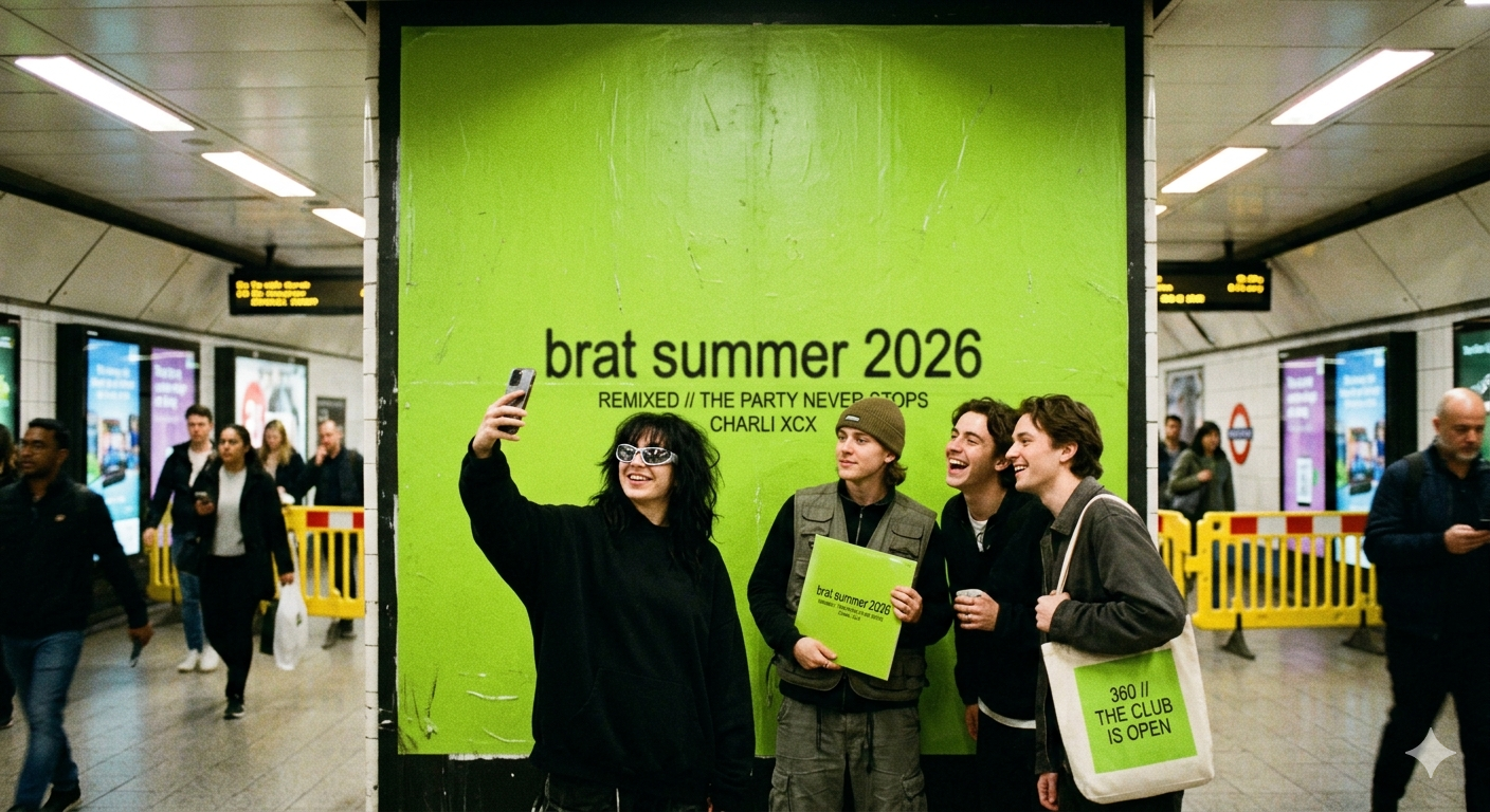
If you have spent any time on the internet lately, you have seen the lime green square. It is bright, it is bold, and it has a tiny bit of blurry black text in the middle. This look comes from the famous singer Charli XCX and her hit album. Even though the album came out a while ago, the brat font is still a massive trend in 2026. Everyone from big brands to political leaders has used this style to look cool and “unbothered.” You do not need to be a graphic designer to make this art. In fact, the whole point of the look is that it is supposed to look a little bit “wrong” and messy.
Using a brat font is the easiest way to make a meme that people will want to share. It captures a specific “vibe” that is all about being yourself, even if you are a little chaotic. In this guide, I will help you find the exact font name, the perfect green color code, and the best tools to make your own art in seconds. We will dive into why this simple design works so well and how you can use it to grow your own social media following. Let’s get started and turn your ideas into viral digital art!
Comparison: Best Ways to Recreate the Brat Aesthetic
| Feature | Official Method | DIY Design Method | AI Generator |
| Font Name | Arial Narrow | Arial (Stretched) | Custom “Brat” Model |
| Color Code | #8ACE00 | Neon/Lime Green | Auto-Applied |
| Difficulty | Very Easy | Medium | Instant |
| Best For | Fans | Professional Posters | Quick Memes |
| Cost | Free | Varies (Software) | Free / Credits |
What is the Actual Brat Font Name?
Many people think the brat font is a special, expensive typeface. The truth is much funnier! The main font used on the album cover is actually Arial Narrow. Yes, the same font you probably have on your computer right now! The designers chose it because it is “basic” and not fancy. To get the look just right, they stretched the letters a little bit and made them look a blurry. This makes the brat font feel raw and real, rather than perfect and polished.
Why is Everyone Obsessed with This Style?
The brat font trend is a rejection of “clean” and “perfect” designs. For years, social media was full of neat, beige, and boring posts. Charli XCX changed that by using a “garish” green that is hard to ignore. When you use the brat font, you are telling the world that you don’t care about being perfect. It is a style that celebrates being “messy” and having fun at the club. In 2026, this “anti-design” look is the most popular way to stand out online.
Finding the Perfect “Brat Green” Color
You can’t have the brat font without that specific neon green background. If the green is too dark, it looks like a lawn. If it is too bright, it hurts the eyes. The official hex code for this famous color is #8ACE00. When you are using a design app like Canva or Photoshop, just type that code in the color picker. It will give you that exact, slightly “off-putting” shade that makes the black brat font pop perfectly on the screen.
How to Create the “Blurry” Effect
One secret to the brat font look is the low resolution. The original artists designed the cover at a very small size and then stretched it out. This made the edges of the letters look fuzzy. To do this yourself, you can type your text in a brat font generator and then take a screenshot. Sometimes, a slightly “bad” quality image looks more authentic! It gives the feeling that the art was made in a hurry while having the time of your life.
Top Brat Font Generators to Use Right Now
If you don’t want to mess with settings, a brat font generator is your best friend. Websites like BratGenerator.com or Kapwing have templates ready for you. You just type your word, and it puts the lowercase brat font on the green square for you. These tools are great because they handle the spacing and stretching automatically. Many of them even let you change the background to the “remix” white or “deluxe” black versions with just one click.
Using the Font for Your Own Brand
Can you use the brat font for a business? Many people do! In 2026, brands use this aesthetic to show they are “tapped in” to pop culture. However, you should use it for fun social media posts rather than a permanent logo. The brat font works best for limited-time sales, event posters, or funny TikTok captions. It tells your audience that your brand has a personality and knows how to have a good time. It’s all about that “cool girl” energy!
DIY: Making the Look in Canva or Picsart
If you want more control, you can build the look yourself. Open a new project and set the background to #8ACE00. Add a text box and choose Arial Narrow or a similar sans-serif font. The most important rule for the brat font is to keep everything in lowercase. Do not use capital letters! Move the text to the center, and if your app allows it, stretch the text vertically just a tiny bit. This creates the iconic, rebellious look that everyone loves.
The Secondary Font: ABC Rom Mono
Did you know there is a second font? While the cover uses Arial, the back of the album and the vinyl labels use a font called ABC Rom Mono. This is a “monospace” font, which means every letter takes up the same amount of space. It looks like it came from an old typewriter or a computer code screen. Pairing this with the main brat font adds a bit of professional “tech” vibes to your design. It is a great secret for true fans!
Common Mistakes to Avoid
When trying to master the brat font, don’t make it too neat. If the letters are perfectly sharp and perfectly centered, it might lose its “brat” energy. Another mistake is using the wrong green. If you use a standard “lime” green, people will know it’s a “fake.” Always stick to the #8ACE00 code. Lastly, remember that the brat font should stay small on the square. Having a lot of “empty” green space is part of what makes the design so famous and bold.
The Cultural Impact of a Simple Font
It is amazing how a simple choice like the brat font can change culture. It moved from a music album to political campaigns and fashion runways. It shows that in 2026, an idea is more important than a fancy budget. Using the brat font is a way to join a global conversation. It is a “shorthand” for a specific type of confidence. Every time you post a green square, you are connecting with millions of people who understand exactly what that vibe means.
Frequently Asked Questions
1. Is the brat font free to download? Yes! Since the brat font is based on Arial Narrow, it is already installed on almost every Windows and Mac computer. You don’t need to pay for a special license to use the basic version.
2. What is the exact hex code for the green? The most accurate hex code used for the aesthetic is #8ACE00. Some people also use #39FF14 for a brighter “neon” look, but the official one is slightly more “olive-lime.”
3. Why is the text always in lowercase? The lowercase style is a huge part of the “brat” attitude. It feels more casual and like a quick text message. Using uppercase letters would make it look too formal and ruin the vibe.
4. Can I make my own brat font cover on my phone? Definitely. Apps like Picsart, Instagram Stories, and Canva mobile are perfect for this. Just use the color code and a simple sans-serif font to get the look in seconds.
5. What does it mean when someone says “Kamala is brat”? This was a famous moment where the brat font and color were used for a political campaign. It showed how the aesthetic could be used to represent a “strong, cool, and bold” leader.
6. Is there an AI that can generate these for me? Yes, tools like Skywork AI or various “Brat Generators” online can take a prompt and create the image for you, including the blurry texture and perfect color.
Conclusion:
The brat font is more than just letters on a screen—it is a symbol of a whole generation’s energy. It is fun, easy to use, and instantly recognizable. Whether you are making a birthday invite or a funny meme for your friends, using this style is a guaranteed way to get attention. So, grab that #8ACE00 green, type some lowercase words, and start creating! The world is your lime-green canvas.